My intention for this unit of work was to use the idea of scale by using high and low angles, and also by editing pictures. My intention was based upon the idea of fantasy and how I can use scale to create a fantasy theme in my pictures. I believe that I have met my intentions. This is because all my shoots clearly link in with the theme of scale and fantasy because of the images making things looking bigger and smaller than they should be. I achieved this by using the right equipment, different angles and using hotshot for the editing process. Having the lego figures available was an advantage for me as I wanted to use them as I had planned to use them in my shoot ideas. The variety of angles I used helped me meet my intention as well. Being able to take shots from extremely high angles such as shoot 5 and 7, it enabled me to relate to scale and use, which I did with the large buildings surrounding the area then the people below who looked significantly small.
My influences and artists are evident in my work. Ive used a few of the artists and their work which I researched about in my work, from it being around the ams idea or just for inspiration. Andrew Whyte is an artists that is evident because of his 'legography' which is where he used lego figures to make them seem like they're moving and exploring the human world. This is what I done in my first 4 shoots with the lego figures, and this was down to the inspiration of Andrew Whyte. Also, William Eggleston is another artist that is evident. I used William Eggleston's 'Tricycle, Memphis' photo as a starting point. In this photo he too a photograph of a children's tricycle but took it from a very low angle, making it seem bigger than everything else in the photo. This gave me the idea for shoots 5, 6 and 7 because I thought of the idea of taking pictures from high angles instead and making certain subjects smaller than they actually are.
A lot of work from this unit did work and went how I planned it to. The artist research was good and that worked very well and the artists I did look at fitted into my theme of using scale. Also, I think a lot of the shoots went well and linked to my artists well.
What I think that didn't work was that I didn't relate my work to more artists. I feel I could have used some of the other artists and their ideas for inspiration which I could have then tried out for myself.
I chose the 4 photos from shoot 4, 5, 6 and 7 because I felt these were my best images and most relatable to my subject theme of scale and fantasy. In addition to, these are my best edits from each of those 4 shoots so they were the best looking ones as well.
I will display my final piece by having the 4 images in a line next to each other on a wall. However, they're all different sizes with the largest scale ones being the smallest in terms of the size of them image and the small scale images being larger in terms of the size of the image. Therefore, from the left it will be the smallest sized image and then the further right you go, the images will get bigger and bigger but the image will be more small scale focused.
Friday, 22 April 2016
Thursday, 21 April 2016
BEST EDITS
My best edits were all done using photoshop. I edited my best image from each of the 7 shoots to create my best edits which will go into my portfolio and blog.
 |
| This is my best edit from shoot 1. There wasn't a lot of editing done for this image as I felt it was already a good standard and looked fine. Thats because of the lighting, rule of thirds and composition which are all good in this image. For this image, all I done was tweak the saturation of the whole image. This was only by a small amount, but this enabled the lego figure to stand out a bit more and the green of the plant to brighten. Therefore, this meant that the two main subjects: the plant and the lego figure, are the first thing you see when looking at the image. |
 |
| This is my best edit from shoot 2. This best edit, like the first one, hasn't has a lot done to it. For this image all I done was use the spot healing tool to clean and tidy the image up. I used it to remove some of the lighting that was caused from the camera flash. In addition to, I also used the quick selection tool to highlight the lego figure. I then increased the brightness slightly and the saturation so the lego figure would stand out even more. |
 |
| This is my best edit from shoot 3. For this image no actual editing was done so it should be called 'best image'. I felt there was nothing no change or anything to improve as I thought the image was absolutely fine, lighting, colours, focus and the able is all good. |
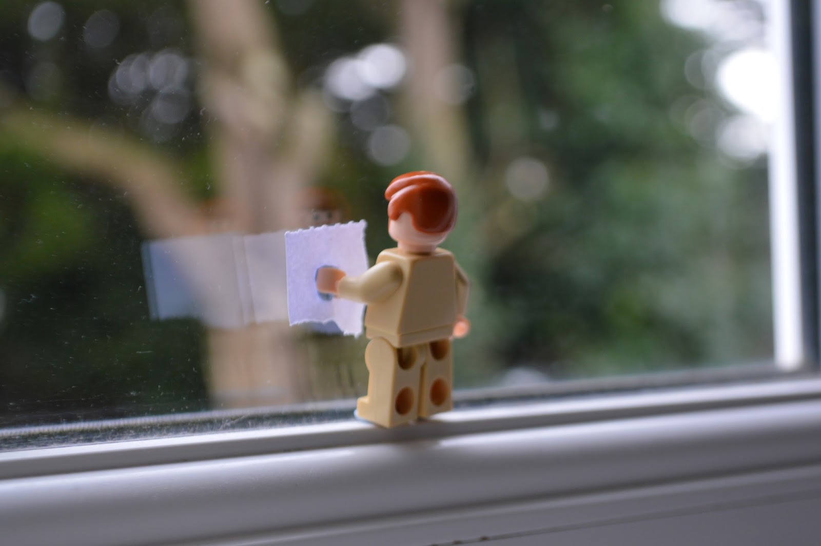 |
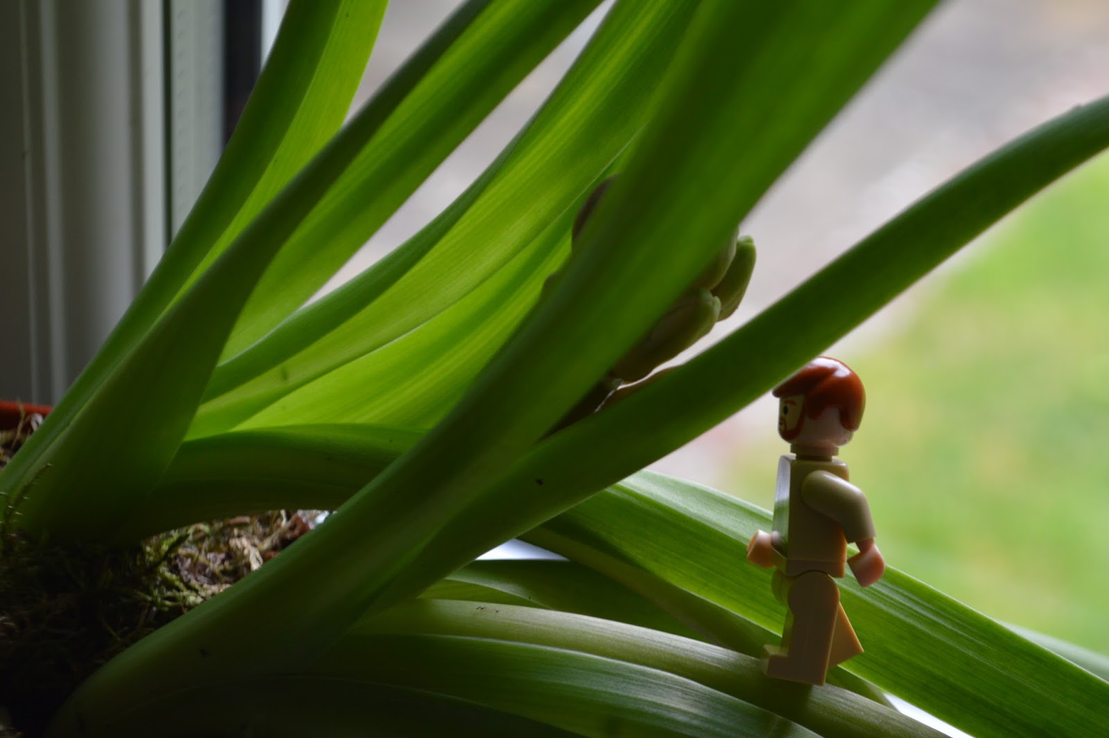
| This is my best edit from shoot 4. There was one piece of editing I done for this image. This was the blurring out of the outline of the window and the glass as well. Although the image was originally blurred apart form the lego figure from the focus of the shot, I wanted to make it more effective, thats why I blurred it out even more. This was so the lego figure stood out more and just because the treelike being blurred created a nice effect, especially as its framed by the window. |
 |
| This is my best edit from shoot 5. This is one my favourite image from this whole unit. I tried to fit the rule of thirds in when taking this image with the street in the middle and the old city buildings either side. For this image I didn't want to remove or add anything as I felt that it would ruin the image. Subsequently, all I done was increased the saturation and change the hue slightly to make the tilings on the roofs more bright and colourful to add more composition and contrast to the image. |
 |
| This is my best edit from shoot 6. This was my favourite image from shoot 6 and I originally imagined it to be different to how it was now when I finished editing. Originally, I kept the image how it was but then I decided to be more creative and use the theme of scale and fantasy more in my work. Therefore, I used one of the images from shoot 3 and cut out the lego figure. I then copied and pasted into onto this image and then using the scale change, I increased the size of the lego figure by another 50% of its original size. I done this because the lego figure would be a good comparison against the baptistery and the people next to it. This is a good way of using scale and it looks like something that would be in a fantasy world because its not every day you see a 30ft tall lego figure. |
 |
| This is my best edit from shoot 7. The editing process for this image didn't involve too much. Firstly, I used the quick selection tool to highlight the sky. This was because the sky was originally too grey and dull so I wanted it to be more brighter and blue. Therefore, I increased the saturation and hue to make the sky blue. This adds more contrast and composition to the image as well. Also, I used quick selection tool on the grass next to the cathedral and increased the saturation of that to make it a brighter green. |
Wednesday, 20 April 2016
SHOOT 7
For my seventh and final shoot, I used the idea which I used in shoot 5 and 6 by comparing buildings and people as they both are very different when using scale. This shoot took place on top of the Leaning Tower of Pisa which was a perfect spot to take some images due to the height and the angles that would be available for me. For this shoot I used a Nikon D3200 with a 18 - 5mm lens. There was no real difficulty taking the shots as I was in the perfect position and there was a large depth of field so I just kept the focus on auto so I could get softer images.
This shoot went really well and links perfectly with my intentions of scale and fantasy. This is because of how the people on the ground look even smaller because of the angle and the buildings around them. My best images from this shoot are images 9 and 12. Image 9 is a good shoot because of the composition of the image with the orange\yellow buildings on the top 1\3, then the grey pathway in the middle and then the green grass on the bottom of the image, creating a nice composition and a rule of thirds. Mostly importantly though, the image is a really good picture to show my idea of using scale. The high angle shot at which it was taken from creates an illusion, making the people on the ground seem really small, like something you'd imagine in a fantasy world. Image 12 is another good shot because of the composition and rule of thirds again. The cathedral covers 2\3 from the right and then there is the green grass on the left hand side with the people. The composition is created with the grey dull coloured cathedral and the bright luscious green grass which creates a contrast as well. The use of scale in this picture is good as well because of the large cathedral which is very striking in the image, then you have the people which look like dots, sitting on the grass.
Overall, this shoot was a great success. This is due to the composition, rule of thirds and the contrast which are in the images. This makes the image amore interesting and adds more detail and movement to the images. In addition to, the angle of the shots has enabled me to shoot at a very high angle above everything in the area. This meant I could choose what I wanted to compare for scale. Therefore, due to the mass amount of people I made them look as small as possible compared to everything else around them as if it was a fantasy world where humans weren't as big.

Thursday, 14 April 2016
SHOOT 6
For my sixth shoot I've used the same idea of using buildings and people but this time the shoot was taken in Pisa, Italy and using The Leaning Tower of Pisa, The Pisa Baptistery and The Pisa Cathedral. For this shoot I used a Nikon D3200 with a 18 - 55mm lens. There was no difficult taking these images since the subjects I was shooting were so far away that I kept the focus on auto as there was a large depth of field.
This shoot was another success and I'm really pleased with it. All the images turned out to be good quality and the buildings themselves makes the images a lot more appealing to the eye. I can't pick a best image from this shoot as they're all decent and relate to the subject of scale due to the buildings towering over the tourists.
Overall, this shoot was a great success. There are many factors which contributed to this success. Firstly, the composition in some of the images is awesome as you have 3 different layers, for example in images 3 and 9 with the green grass, white buildings and then the gorges blue sky. Also, the angle and depth of field of the shots have enabled me to mess with scale better since there were so many people walking about which I used to my advantage to make them slightly bigger or smaller compared to the buildings. These were all candid and no one posed for the shots as well. Finally, I have used the rule of thirds in some of the images such as image 3. My next shoot is the same idea again with the buildings but my next shoot took place on top of The Leaning Tower of Pisa which enabled me to shoot down from a extremely high angle like I did in shoot 5.

SHOOT 5
For my fifth shoot I went away from the idea of using toys and used a larger subject. This shoot took place in Lisbon, Portugal due to myself being able to go up the Santa Just a lift in the city centre which enabled me to take photos high above the city and the people walking around which is a good way to take scale focused photos. For this shoot I used a Nikon d3200 with a 18 - 55mm lens. I had the cameras focus settings on manual so that I could achieve a better focus on the surroundings below me. In addition to, the wired fence in the way meant I needed to focus on the city and not the wired fence.
This shoot went really well and I'm really happy with the images as it perfectly links with the subject of scale. My favourite images from this shoot are images 4, 5 and 11. This is because of the angle of the shots which is at a very high angle due to the height I took the shots from and the fact I was facing the camera at a near vertical angle. This enabled me to fit in the street down the middle of the picture with the large buildings either side. This makes the people walking down the street seem a lot smaller due to the comparison between them and the buildings. However, images 1 and 2 are probably my least favourite and don't reflect the subject of scale very well. This is because of how zoomed out the shots are which makes everything look near the same size and the wired fence in front of the city just overall looks poor and brings no meaning to the image.
Overall, I'm really pleased with this shoot and is probably my favourite for this unit so far. The main factors that have made this shoot good is the composition in the images with the orange tiled buildings with the white painted walls which have a composition with the dark shaded street. Also, the angles of the shots because of the extremely high angle they were taken at to make the sense of scale greater. My next shoots are of a similar idea by comparing buildings and people.

Wednesday, 23 March 2016
SHOOT 4
For my fourth shoot I used the lego figure again but this is for the last time as I want to experiment using scale in another way. This shoot took place in my bedroom because of the windows and that it was on the second floor so I could fit the green vegetation into the background of the images. For this shoot I used a Nikon D3200 with a 18 - 55mm lens. I experimented using the zoom with the 18 - 55m lens with close up shots and then long shots where I had the lego figure looks smaller. I used manual focus for this shoot as well as the camera kept focusing on the window so I used manual to focus on the lego figure.
This shoot went real and reflects well with the other shoots. There were a variety of factors that contributed to this shoot. Firstly, the lighting in the shots is perfect as it creates a nice composition between the lego figure and the green vegetation in the background. In addition to, the angle of the shots are satisfactory because of the different close ups which use scale well as it varies the size of the lego figure in each shot. A good example of this is image 11. However, there is an image that I wasn't too happy with. An example of this is image 1 because of the lighting. The flash from the camera has caused the image to become too bright and you can also see the reflections on the window from the flash.
Overall, I'm really pleased with this shoot as I've been able to make it look as if the lego figure is cleaning the window, bringing movement to the Images. In addition to, the shape of the window creates a frame for the image, thus framing the lego figure. Lastly, the green vegetation in the background creates contrast and composition which adds more detail to the image. For my next few shoots In plan on using humans and human objects to experiment with scale and shoot large scale images instead of small scale images like I've done with the lego figure.

Monday, 21 March 2016
SHOOT 3
For my third shoot I used the idea of using a lego figure again but used two instead of one this time. This shoot took place in my kitchen, the same place as shoot 1 and 2. This is because the kitchen top had a lot of space to do this shoot and was flat. In addition to, the lighting with the sun shining through the windows naturally brightened the image which look a lot better. For this shoot I used a Nikon D3200 with a 18 - 55mm lens. I used manual focus for this shoot because I had the two figures at different distances away from the lens. Therefore I needed to be able to have both in focus or have the camera specifically focus on one of the figures. I did experiment with flash in this shoot, but I feel the natural lighting without the flash creates a better image.
This shoot went well and this is down to a variety of factors. The way the lego figures are positioned makes the image look real with the monkey about to crush Obi Won Kenobi by using a hole puncher. The lighting is also good because it not too bright or dark and this creates a nice composition to go with the image. My favourite image from this shoot is image 6. This is because the lighting is perfect which shows enough detail and looks natural, not staged. In addition to, the focus of the image is good because both characters are in focus. However, there were a couple of images that I weren't happy with. Image 3 is a good example of this. The lighting is the main problem here because the flash from the camera is too bright, causing reflections to show which I think look bad.
Overall, Im happy with this shoot as I experimented by using another subject with the added lego character. Most of the images are well taken with good lighting and angles of shot. For my next shoot I plan on doing another shoot with the lego figures.

Tuesday, 15 March 2016
SHOOT 2
For my second shoot I used the lego figure again to show how a living lego figure would look in the real world. The shoot took place in my kitchen sink as I wanted to do a shoot where the lego figure looked like he is going to dive into the water which I filled up.
For this shoot I used a Nikon D3200 with a 18 - 55mm lens. I had the focus on 'autofocus' so I could get the best quality image and so the lego figure wasn't blurred. In addition to, I experimented with flash in some of the images to see if it created a better lighting for the scene.
This shoot was better than how I'd imagine it to look. This is down to a variety of factors. Firstly, shoot 1 and 6 are the best examples of why this shoot went well, and are also my favourite images from this shoot. The angle of the shot in these images are well positioned because they aren't zoomed too far out like the other images and are close up. Also, the lighting is perfect due to the flash from the camera which brightens these images significantly. Another factor is that both these images are well in focus and are very sharp, providing a better looking and quality photo. However, there a few negatives to point about from some images. Shoot 3 wasn't the best of shots. It is not in focus, thus the blurred image. In addition to, the lighting is too dark which brings less detail to the image and less composition.
Overall, Im pleased with this shoot as most of the images turned out well and its another shoot too add to the lego theme. I don't plan on editing images from this shoot but I may tweak some of the images i.e. the saturation. For my next shoot I'm going to use the lego figure again but just with a different scene.

Wednesday, 9 March 2016
SHOOT 1
For my first shoot I done a shoot using a lego figure to show how a living toy would move in the human world. This shoot took place in my kitchen due to the night lighting which was perfect for the shoot as the lighting was natural, thus making the shot look more realistic. In addition to, the plant in the kitchen was what I needed due to the large stems of the plant to create a bigger comparison with the lego figure. For this shoot I used a Nikon D3200 with a 18 - 55mm lens. I I experimented with and without flash in various images to see which created the better lighting. In addition to this, I feel without flash created a better image.
The shoot went really well and I'm happy with most of the images from this shoot. My favourite images from this shoot are images 6 and 10. This is because of the lighting and the positioning; the angle of the shot and the positioning got the lego figure. The lighting creates a nice composition and the positioning creates movement within the image so it looks like the lego figure is moving and real. However, the images that I fell could've been better were images 1 and 4. Firstly with image 1 the lighting isn't good enough as its too bright due to the use of flash and its zoomed too far out and doesn't give any detail or composition. Image 4's good apart from the lighting, which is far too dark and not bright enough.
Overall, I'm very pleased with this shoot as most of the images turned out to be good and its how I imagined it to look when going through shoot ideas. For this shoot I don't intend on editing for my best edit as I want to have a 'no filter' effect and keep the images as real as possible. With my next shoot Im planning on using the lego figures again but in different situation/scene.

JIM DENEVAN
Jim Denevan is an artist who is based in Santa Cruz, California, USA. He creates temporary drawings on sand, earth and ice which are eventually erased by the natural processes of waves and weather. The drawings range in scale and proportion from large scale land works the size of a city to smaller beach compositions.
Jim's work is really inspiring and so creative. The work he does is at such a large scale in terms of work and the actually scale of the the work. Some of these patterns he has created are amazing and how he makes some of the perfectly symmetrical will be always be a question of mine.
I could use his work as an idea. The large scale drawings into the ground could be something I can do or a guideline. For example, I could create something else, but it could be at a much smaller scale or a large scale version like Jim does.
 |
| Jim Denevan2010 Lake Baikal, Siberia |
 |
| Jim Denevan2009 Black Rock Desert, NV |
 |
| Jim Denevan2010 Vancouver, BC |
Tuesday, 8 March 2016
WILLIAM EGGLESTON
The idea of using scale in my work has definitely interested me. This use of scale fits in with the idea of fantasy as I could make things considerably bigger or smaller than they actually are with the power of a camera. I have found a few artists who have images that use scale really well, which takes a while to realise how they done it.
This photo by William Eggleston is a perfect example of what else I could do with my shoots, using the idea of scale. The idea of using toy vehicles is another good idea as its different to using the lego figures. Also, I could try and make these toy vehicles look the same size as a normal human vehicle in the real world which would fit in well with my whole idea. In addition to, this is an unedited picture so I could try using scale without any editing.
 |
| Tricycle, Memphis William Eggleston 1969 - 1970 |
Saturday, 5 March 2016
CLAES OLDENBURG
Claes Oldenburg is an American sculptor, best known for his public art work of everyday objects at a much larger scale. Claes' work interests me because of how large-scaled the projects are and the end results are mind-blowing and it actually seems like you're in a fantasy world when looking at these everyday objects because your used to seeing them at a much smaller scale.
The idea of having a shuttlecock on the lawn came from Claes' wife, Coosje. She saw a painting of a Native American wearing a headdress which led to the whole concept of large feathers scattered over the lawn, as they had fell off a passing bird. They were then looking at a map of the site and realised it had a similar layout to that of a tennis court. They then thought that ball sculptures catered along the lawn would be good but then realise fit would be too repetitive. This led to them combining the idea of a feather and ball to create the idea of using shuttlecocks. There are 4 shuttle cocks scattered along the lawns of the site as you have the museum building in the middle which acts as a net and then the lawns on both sides with the shuttlecocks.
This is a really good piece of work because of the whole idea behind it and that it was so simple. The idea of a tennis court or badminton court but enlarged using buildings and grass is amazing and then to add the shuttlecocks to this which stand out on the lush green grass really well.
 |
| Claes Oldenburg Shuttlecocks 1994 |
This is a really good piece of work because of the whole idea behind it and that it was so simple. The idea of a tennis court or badminton court but enlarged using buildings and grass is amazing and then to add the shuttlecocks to this which stand out on the lush green grass really well.
Aluminium and fiber-reinforced plastic; painted with polyurethane enamel
Four shuttlecocks, each 17 ft. 11 in. (5. 5 m) high x 15 ft. 1 in. (4.6 m) crown diameter and 4 ft. (1.2 m) nose cone diameter, sited in different positions on the grounds of the museum.
 |
| Claes Oldenburg Dropped Cone 2001
The idea of using an ice cream cone for the next project came from the fact that most the ice cream parlours in Cologne, Germany have a large plastic ice cream cone in front of them, which are very popular in the area. The subject was irresistible to Claes and Coosje, especially as they found the word 'cone' concealed in the letters of the city's name.
This piece of work is another piece that interests me because of how it's differentiated from the everything else around it and and the emphasis on the cone separates it from the advertising variations found in the street.
Stainless and galvanized steels, fiber-reinforced plastic, balsa wood; painted with polyester gelcoat
39 ft. 10 in. (12.1 m) high x 19 ft. (5.8 m) diameter; height above building: 32 ft. 10 in. (10 m) |
 |
| Claes Oldenburg Spoonbridge and Cherry 1988
The Minneapolis Sculpture Garden is located in front of the Walker Art Centre, Minneapolis.
In searching for a subject that was horizontal and included fountain elements, so as not to dominate the other sculptures in the garden, he tried a spoon over water, terminating in an island.
The cherry stem was situated in a contrapposto relation to the curve of the spoon and eventually turned into a fountain: while spray from the end of the stem disperses in the air, water issues silently from its base, coating the cherry so that it glistens.
Overall, the piece of work is so eye catching because of the size comparison between the Spoonbridge and Cherry and the buildings, people and trees around the work that looks contrastingly small.
29 ft. 6 in. x 51 ft. 6 in. x 13 ft. 6 in. (9 x 15.7 x 4.1 m) |
Friday, 4 March 2016
ADELE J BARON
The idea of using scale in my work has definitely interested me. This use of scale fits in wight he idea of a fantasy world as I could make things considerably bigger or smaller than they actually are in the real world with the power of a camera. I have found a few artists who have images that use scale really well, which takes a while to realise how they done it.
This is an artist I found on Flickr who uses scale as one of her themes. In this picture the larger pumpkin has been edited into the picture. This is a really good idea of how I could use scale and that I can take normal pictures but then edit them to mess with scale and how people view the image.
This is another image created by Flickr user Adele J Baron. In this image there is a child laying down who is facing upwards. Standing on top of this child's face is another child who is much smaller and is facing downwards on the other child laying down. For this picture the artist has clearly edited the smaller child into the picture and decreased the size of the person. This is an idea I could use for my shoots where I edit people or objects into pictures to use scale as a comparison.
 |
| The Giant Pumpkin Adele J Baron October, 2015 |
 |
| Does Size Matter? Adele J Baron July, 2014 |
JD HANCOCK
JD Hancock is from Austin, Texas, USA. Professionally he builds on websites and apps for a living and photography is one of the things he does for fun. JD says his photography is "mostly of the slightly-giggle-worthy-pop-culture-reference variety".
The equipment JD uses is a Nikon D50 and Nikon Coolpix S50 point-and-shoot which he used in his earlier work. However, sometimes he'll use his iPhone. In addition to, he uses iPhoto for image management and post-processing and occasionally photoshop.
This photo is from JD's series called 'iPhoneland' which is a sub-series of his main series called 'Little Dudes'. In this series he uses an iPhone to set the background for his 'little dudes'. The idea for this photo came from the summer time and JD wondered how the 'little dudes' would spend their summer. This gave him the idea of using the iPhone as a swimming pool and it was the perfect scale to use with the miniature train figures.
This is another photo from the 'Little dudes' series. In this photo we can see one of the 'little dudes' sitting by himself on an old type writer. The figure is sitting on the letter K which I found out that it wasn't on purpose and has no meaning, the artist just randomly placed the miniature figure. I like the composition of the picture as you have the white circles for the letters and then the black of the type writer. In addition to, the green outfit that the 'little dude' is wearing really stands out, which creates a nice composition. Also, I like the angle of which the photo was taken where the type writer goes from the bottom right of the picture to the top left.
This photo is also from the 'Little dudes' series. In this photo we can see two of the miniature figures in the bottom left side of the image. They seem to be reaching one hand up each and feeling the frame, as the title clearly implies. This shows how small these 'Little dudes' are in this human world and is a good use of scale by the artist.
The equipment JD uses is a Nikon D50 and Nikon Coolpix S50 point-and-shoot which he used in his earlier work. However, sometimes he'll use his iPhone. In addition to, he uses iPhoto for image management and post-processing and occasionally photoshop.
 |
| Swimming in the iPool JD Hancock April, 2009 |
 |
| Berry Hard Work JD Hancock April, 2013
This another photo from the series 'Little Dudes'. His description of this series is 'documenting the little dudes who live in my phone'. The colours and focus in this photo are extravagant because the red is really emphasised as well as the focus concentrating on the 'little dues' working. This photo actually makes it seem like these 'little dudes' are alive and moving as they're mining the artists strawberries that are in his home to most probably eat to survive in this human world.
|
 |
| The Anxious Type JD Hancock May, 2009 |
This is another photo from the 'Little dudes' series. In this photo we can see one of the 'little dudes' sitting by himself on an old type writer. The figure is sitting on the letter K which I found out that it wasn't on purpose and has no meaning, the artist just randomly placed the miniature figure. I like the composition of the picture as you have the white circles for the letters and then the black of the type writer. In addition to, the green outfit that the 'little dude' is wearing really stands out, which creates a nice composition. Also, I like the angle of which the photo was taken where the type writer goes from the bottom right of the picture to the top left.
 |
| Feel The Frame Friday JD Hancock October, 2009 |
ANDREW WHYTE
Andrew Whyte is an English photographer who I found while looking through the internet for artists who relates to my theme of perspectives. His work called 'Legography' really caught my attention due to the unique perspective of the miniature lego figures living in the real world.
The pictures from this project are very unique and inspiring. The way he has set up the lego figures in the frame is very interesting because its like the lego figures are moving but he has just captured a snapshot while they go about their own business. This links perfectly with my idea of capturing lego figures in the real world as if they were part of human life. This fits perfectly with the theme of fantasy as its something you could only imagine or dream of seeing.
The pictures from this project are very unique and inspiring. The way he has set up the lego figures in the frame is very interesting because its like the lego figures are moving but he has just captured a snapshot while they go about their own business. This links perfectly with my idea of capturing lego figures in the real world as if they were part of human life. This fits perfectly with the theme of fantasy as its something you could only imagine or dream of seeing.
 |
| Lack of communication Andrew Whyte 2007 - 2014 This first photo captures the lego figure looking into a green glass bottle that seems to have been left on the ground. The way the lego figure is looking into it is interesting as it makes you wonder if he's seen something or just investigating man made objects. |
 |
| Time well spent Andrew Whyte 2007 - 2014 This second photo captures a lego figure walking along the beach with his camera. The way he is positioned so it looks like he's in a walking motion is interesting as its just like a human motion but with a lego figure. The way the focus of the photo is concentrated onto he beach and the figure with the blurred sea is perfect as well. In addition to, it creates a good composition to the image. |
 |
| Dirty stop-out Andrew Whyte 2007 - 2014 This third photo is of the same lego figure using his camera to capture the beautiful and composite sunset. The way the lego figure and the ground he's standing on is darkened creates a nice contrast between that and the sunset. The sunset itself is a nice capture with all the different colours giving the image a even greater composition. |
 |
| Vantage Point Andrew Whyte 2007 - 2014 This fourth photo is of the lego figure climbing the railings next to the railway line. The lego figure is again, taking a picture of the train with his camera. The way the figure is stood there is brilliant as well as the focus of the camera. The composition of the image is good as well and the angle of the shot because of the way the railing change size from left to right. |
Subscribe to:
Posts (Atom)