My best edits were all done using photoshop. I edited my best image from each of the 7 shoots to create my best edits which will go into my portfolio and blog.
 |
| This is my best edit from shoot 1. There wasn't a lot of editing done for this image as I felt it was already a good standard and looked fine. Thats because of the lighting, rule of thirds and composition which are all good in this image. For this image, all I done was tweak the saturation of the whole image. This was only by a small amount, but this enabled the lego figure to stand out a bit more and the green of the plant to brighten. Therefore, this meant that the two main subjects: the plant and the lego figure, are the first thing you see when looking at the image. |
 |
| This is my best edit from shoot 2. This best edit, like the first one, hasn't has a lot done to it. For this image all I done was use the spot healing tool to clean and tidy the image up. I used it to remove some of the lighting that was caused from the camera flash. In addition to, I also used the quick selection tool to highlight the lego figure. I then increased the brightness slightly and the saturation so the lego figure would stand out even more. |
 |
| This is my best edit from shoot 3. For this image no actual editing was done so it should be called 'best image'. I felt there was nothing no change or anything to improve as I thought the image was absolutely fine, lighting, colours, focus and the able is all good. |
 |
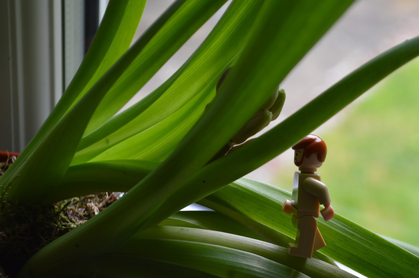
| This is my best edit from shoot 4. There was one piece of editing I done for this image. This was the blurring out of the outline of the window and the glass as well. Although the image was originally blurred apart form the lego figure from the focus of the shot, I wanted to make it more effective, thats why I blurred it out even more. This was so the lego figure stood out more and just because the treelike being blurred created a nice effect, especially as its framed by the window. |
 |
| This is my best edit from shoot 5. This is one my favourite image from this whole unit. I tried to fit the rule of thirds in when taking this image with the street in the middle and the old city buildings either side. For this image I didn't want to remove or add anything as I felt that it would ruin the image. Subsequently, all I done was increased the saturation and change the hue slightly to make the tilings on the roofs more bright and colourful to add more composition and contrast to the image. |
 |
| This is my best edit from shoot 6. This was my favourite image from shoot 6 and I originally imagined it to be different to how it was now when I finished editing. Originally, I kept the image how it was but then I decided to be more creative and use the theme of scale and fantasy more in my work. Therefore, I used one of the images from shoot 3 and cut out the lego figure. I then copied and pasted into onto this image and then using the scale change, I increased the size of the lego figure by another 50% of its original size. I done this because the lego figure would be a good comparison against the baptistery and the people next to it. This is a good way of using scale and it looks like something that would be in a fantasy world because its not every day you see a 30ft tall lego figure. |
 |
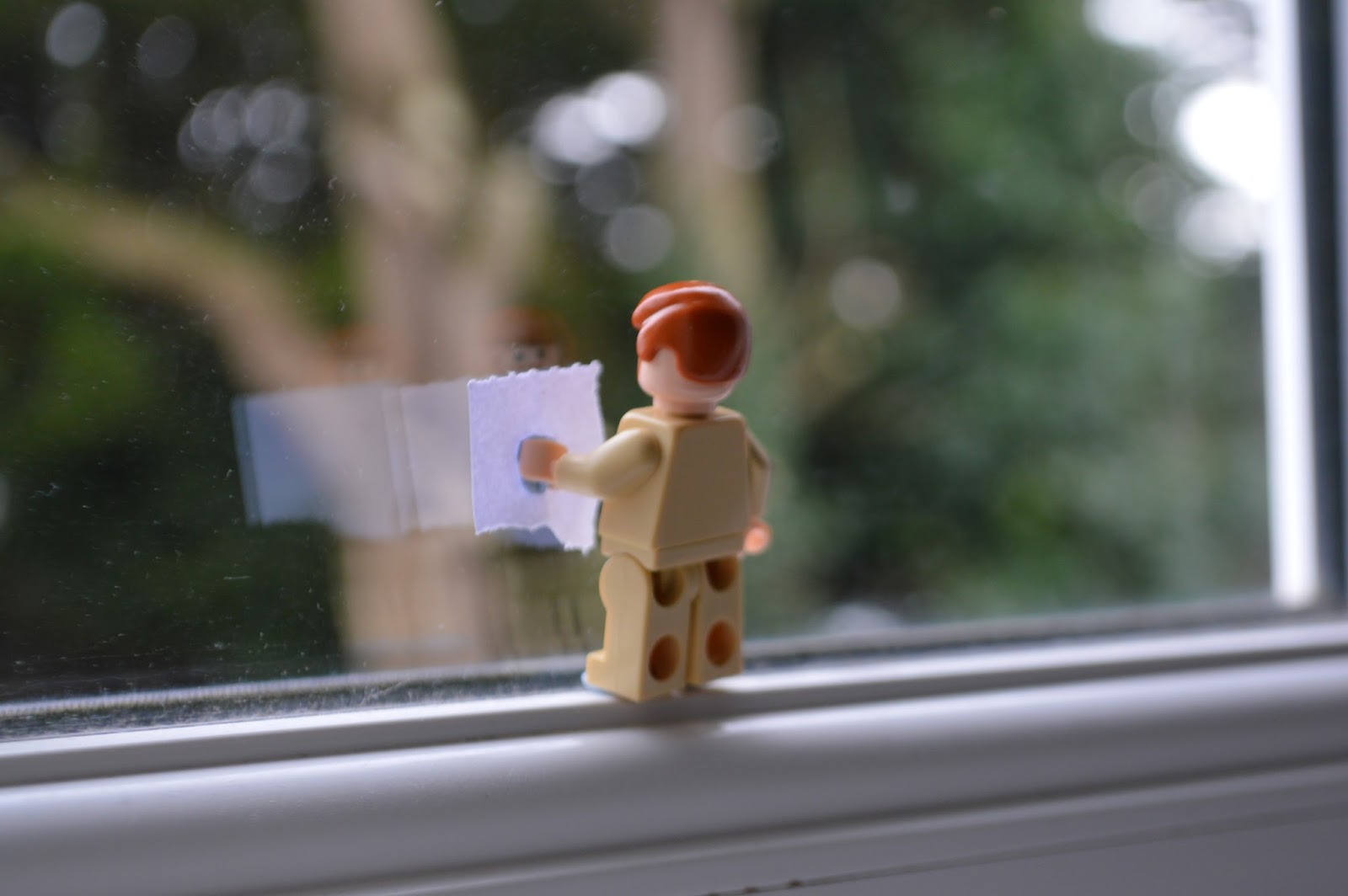
| This is my best edit from shoot 7. The editing process for this image didn't involve too much. Firstly, I used the quick selection tool to highlight the sky. This was because the sky was originally too grey and dull so I wanted it to be more brighter and blue. Therefore, I increased the saturation and hue to make the sky blue. This adds more contrast and composition to the image as well. Also, I used quick selection tool on the grass next to the cathedral and increased the saturation of that to make it a brighter green. |


No comments:
Post a Comment