My intention for this unit of work was to use the idea of scale by using high and low angles, and also by editing pictures. My intention was based upon the idea of fantasy and how I can use scale to create a fantasy theme in my pictures. I believe that I have met my intentions. This is because all my shoots clearly link in with the theme of scale and fantasy because of the images making things looking bigger and smaller than they should be. I achieved this by using the right equipment, different angles and using hotshot for the editing process. Having the lego figures available was an advantage for me as I wanted to use them as I had planned to use them in my shoot ideas. The variety of angles I used helped me meet my intention as well. Being able to take shots from extremely high angles such as shoot 5 and 7, it enabled me to relate to scale and use, which I did with the large buildings surrounding the area then the people below who looked significantly small.
My influences and artists are evident in my work. Ive used a few of the artists and their work which I researched about in my work, from it being around the ams idea or just for inspiration. Andrew Whyte is an artists that is evident because of his 'legography' which is where he used lego figures to make them seem like they're moving and exploring the human world. This is what I done in my first 4 shoots with the lego figures, and this was down to the inspiration of Andrew Whyte. Also, William Eggleston is another artist that is evident. I used William Eggleston's 'Tricycle, Memphis' photo as a starting point. In this photo he too a photograph of a children's tricycle but took it from a very low angle, making it seem bigger than everything else in the photo. This gave me the idea for shoots 5, 6 and 7 because I thought of the idea of taking pictures from high angles instead and making certain subjects smaller than they actually are.
A lot of work from this unit did work and went how I planned it to. The artist research was good and that worked very well and the artists I did look at fitted into my theme of using scale. Also, I think a lot of the shoots went well and linked to my artists well.
What I think that didn't work was that I didn't relate my work to more artists. I feel I could have used some of the other artists and their ideas for inspiration which I could have then tried out for myself.
I chose the 4 photos from shoot 4, 5, 6 and 7 because I felt these were my best images and most relatable to my subject theme of scale and fantasy. In addition to, these are my best edits from each of those 4 shoots so they were the best looking ones as well.
I will display my final piece by having the 4 images in a line next to each other on a wall. However, they're all different sizes with the largest scale ones being the smallest in terms of the size of them image and the small scale images being larger in terms of the size of the image. Therefore, from the left it will be the smallest sized image and then the further right you go, the images will get bigger and bigger but the image will be more small scale focused.
Friday, 22 April 2016
Thursday, 21 April 2016
BEST EDITS
My best edits were all done using photoshop. I edited my best image from each of the 7 shoots to create my best edits which will go into my portfolio and blog.
 |
| This is my best edit from shoot 1. There wasn't a lot of editing done for this image as I felt it was already a good standard and looked fine. Thats because of the lighting, rule of thirds and composition which are all good in this image. For this image, all I done was tweak the saturation of the whole image. This was only by a small amount, but this enabled the lego figure to stand out a bit more and the green of the plant to brighten. Therefore, this meant that the two main subjects: the plant and the lego figure, are the first thing you see when looking at the image. |
 |
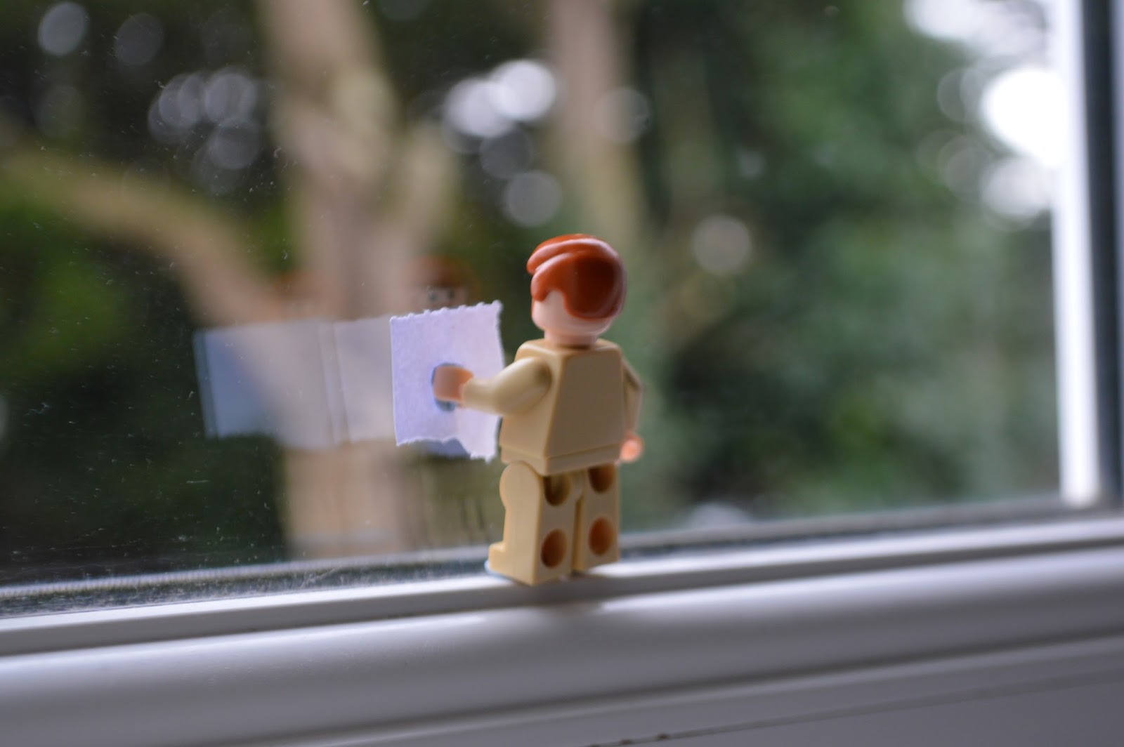
| This is my best edit from shoot 2. This best edit, like the first one, hasn't has a lot done to it. For this image all I done was use the spot healing tool to clean and tidy the image up. I used it to remove some of the lighting that was caused from the camera flash. In addition to, I also used the quick selection tool to highlight the lego figure. I then increased the brightness slightly and the saturation so the lego figure would stand out even more. |
 |
| This is my best edit from shoot 3. For this image no actual editing was done so it should be called 'best image'. I felt there was nothing no change or anything to improve as I thought the image was absolutely fine, lighting, colours, focus and the able is all good. |
 |
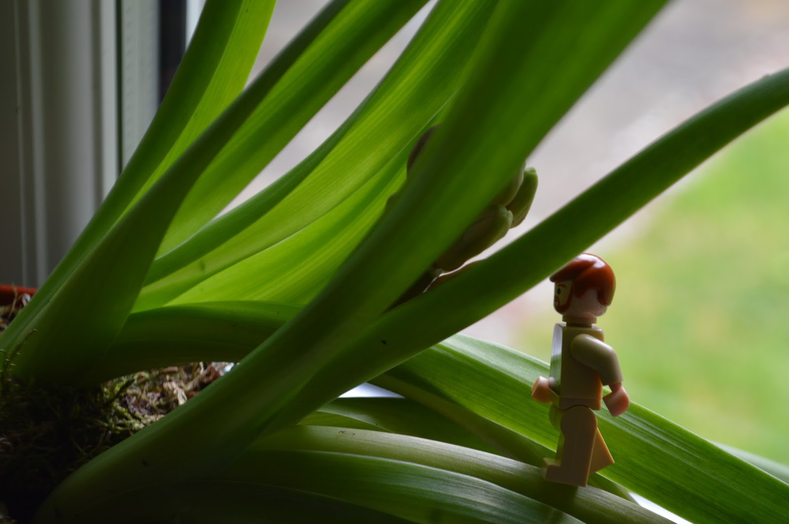
| This is my best edit from shoot 4. There was one piece of editing I done for this image. This was the blurring out of the outline of the window and the glass as well. Although the image was originally blurred apart form the lego figure from the focus of the shot, I wanted to make it more effective, thats why I blurred it out even more. This was so the lego figure stood out more and just because the treelike being blurred created a nice effect, especially as its framed by the window. |
 |
| This is my best edit from shoot 5. This is one my favourite image from this whole unit. I tried to fit the rule of thirds in when taking this image with the street in the middle and the old city buildings either side. For this image I didn't want to remove or add anything as I felt that it would ruin the image. Subsequently, all I done was increased the saturation and change the hue slightly to make the tilings on the roofs more bright and colourful to add more composition and contrast to the image. |
 |
| This is my best edit from shoot 6. This was my favourite image from shoot 6 and I originally imagined it to be different to how it was now when I finished editing. Originally, I kept the image how it was but then I decided to be more creative and use the theme of scale and fantasy more in my work. Therefore, I used one of the images from shoot 3 and cut out the lego figure. I then copied and pasted into onto this image and then using the scale change, I increased the size of the lego figure by another 50% of its original size. I done this because the lego figure would be a good comparison against the baptistery and the people next to it. This is a good way of using scale and it looks like something that would be in a fantasy world because its not every day you see a 30ft tall lego figure. |
 |
| This is my best edit from shoot 7. The editing process for this image didn't involve too much. Firstly, I used the quick selection tool to highlight the sky. This was because the sky was originally too grey and dull so I wanted it to be more brighter and blue. Therefore, I increased the saturation and hue to make the sky blue. This adds more contrast and composition to the image as well. Also, I used quick selection tool on the grass next to the cathedral and increased the saturation of that to make it a brighter green. |
Wednesday, 20 April 2016
SHOOT 7
For my seventh and final shoot, I used the idea which I used in shoot 5 and 6 by comparing buildings and people as they both are very different when using scale. This shoot took place on top of the Leaning Tower of Pisa which was a perfect spot to take some images due to the height and the angles that would be available for me. For this shoot I used a Nikon D3200 with a 18 - 5mm lens. There was no real difficulty taking the shots as I was in the perfect position and there was a large depth of field so I just kept the focus on auto so I could get softer images.
This shoot went really well and links perfectly with my intentions of scale and fantasy. This is because of how the people on the ground look even smaller because of the angle and the buildings around them. My best images from this shoot are images 9 and 12. Image 9 is a good shoot because of the composition of the image with the orange\yellow buildings on the top 1\3, then the grey pathway in the middle and then the green grass on the bottom of the image, creating a nice composition and a rule of thirds. Mostly importantly though, the image is a really good picture to show my idea of using scale. The high angle shot at which it was taken from creates an illusion, making the people on the ground seem really small, like something you'd imagine in a fantasy world. Image 12 is another good shot because of the composition and rule of thirds again. The cathedral covers 2\3 from the right and then there is the green grass on the left hand side with the people. The composition is created with the grey dull coloured cathedral and the bright luscious green grass which creates a contrast as well. The use of scale in this picture is good as well because of the large cathedral which is very striking in the image, then you have the people which look like dots, sitting on the grass.
Overall, this shoot was a great success. This is due to the composition, rule of thirds and the contrast which are in the images. This makes the image amore interesting and adds more detail and movement to the images. In addition to, the angle of the shots has enabled me to shoot at a very high angle above everything in the area. This meant I could choose what I wanted to compare for scale. Therefore, due to the mass amount of people I made them look as small as possible compared to everything else around them as if it was a fantasy world where humans weren't as big.

Thursday, 14 April 2016
SHOOT 6
For my sixth shoot I've used the same idea of using buildings and people but this time the shoot was taken in Pisa, Italy and using The Leaning Tower of Pisa, The Pisa Baptistery and The Pisa Cathedral. For this shoot I used a Nikon D3200 with a 18 - 55mm lens. There was no difficult taking these images since the subjects I was shooting were so far away that I kept the focus on auto as there was a large depth of field.
This shoot was another success and I'm really pleased with it. All the images turned out to be good quality and the buildings themselves makes the images a lot more appealing to the eye. I can't pick a best image from this shoot as they're all decent and relate to the subject of scale due to the buildings towering over the tourists.
Overall, this shoot was a great success. There are many factors which contributed to this success. Firstly, the composition in some of the images is awesome as you have 3 different layers, for example in images 3 and 9 with the green grass, white buildings and then the gorges blue sky. Also, the angle and depth of field of the shots have enabled me to mess with scale better since there were so many people walking about which I used to my advantage to make them slightly bigger or smaller compared to the buildings. These were all candid and no one posed for the shots as well. Finally, I have used the rule of thirds in some of the images such as image 3. My next shoot is the same idea again with the buildings but my next shoot took place on top of The Leaning Tower of Pisa which enabled me to shoot down from a extremely high angle like I did in shoot 5.

SHOOT 5
For my fifth shoot I went away from the idea of using toys and used a larger subject. This shoot took place in Lisbon, Portugal due to myself being able to go up the Santa Just a lift in the city centre which enabled me to take photos high above the city and the people walking around which is a good way to take scale focused photos. For this shoot I used a Nikon d3200 with a 18 - 55mm lens. I had the cameras focus settings on manual so that I could achieve a better focus on the surroundings below me. In addition to, the wired fence in the way meant I needed to focus on the city and not the wired fence.
This shoot went really well and I'm really happy with the images as it perfectly links with the subject of scale. My favourite images from this shoot are images 4, 5 and 11. This is because of the angle of the shots which is at a very high angle due to the height I took the shots from and the fact I was facing the camera at a near vertical angle. This enabled me to fit in the street down the middle of the picture with the large buildings either side. This makes the people walking down the street seem a lot smaller due to the comparison between them and the buildings. However, images 1 and 2 are probably my least favourite and don't reflect the subject of scale very well. This is because of how zoomed out the shots are which makes everything look near the same size and the wired fence in front of the city just overall looks poor and brings no meaning to the image.
Overall, I'm really pleased with this shoot and is probably my favourite for this unit so far. The main factors that have made this shoot good is the composition in the images with the orange tiled buildings with the white painted walls which have a composition with the dark shaded street. Also, the angles of the shots because of the extremely high angle they were taken at to make the sense of scale greater. My next shoots are of a similar idea by comparing buildings and people.

Subscribe to:
Posts (Atom)